Before I started with a concrete design I simply drafted up
a simple variety of sketches, mainly of random concepts that I felt would be
mildly interesting as an image in a puzzle. These ranged from dragons and dead
space skeletons, my usual characters Falafael and Todd, and some miscellaneous
creatures I created originally.
One of the main motivations/appeals for this concept also
goes hand-in-hand with one of my introduction and tutorial books that I've read
and taken lessons from numerous times through the years. Even now I still find
it relevant and interesting. It was the main source of inspiration for many of
my more recent, horror-creature creations alongside the more fleshy textures
that I use.
The book is 'Drawing
and Painting the Undead- create gruesome ghouls for graphic novels, computer
games and animation' by Keith Thompson. It was given to me as a gift many
years ago by my mother and I've base many original concepts and drafted
creatures on the inspirations I found in this book.
Indeed, my habit of thumbnails and scribbled sketches (in
preparation for a final piece) became more habitual after reading this book,
since it's one of the first ideas Thompson stresses at the start of each piece
and my sketches certainly got inspired by that since I originally wasn’t very
prone to plotting out my work.
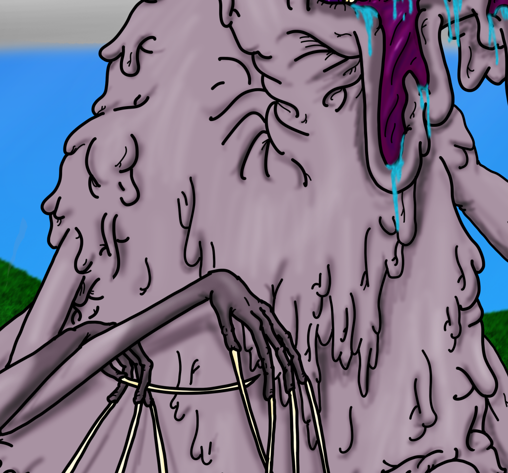
The main focus of the puzzle, the fleshy, four-armed beast
is also inspired by Thompson's work, namely the thick, fleshy texturing on the
majority of his creations. He has a habit of drawing undead and other macabre
creatures. Unlike many other horror artists, he doesn’t go for vast quantities
of blood, scaly monsters or feral furry beasts instead he keeps the majority of
his monsters fleshy and hairless. While some might not consider it gruesome, I
personally prefer this approach, as well as the creepy, human-flesh tones he
works with.
It’s some kind of ghoul herder and keeps some as vicious
pets; as you can see, the Anthropophagus is very fleshy and keeps normal human
skin. While it’s obviously not human, it keeps many proportions (barring lack
of head and chest-face) as well as a human skin tone. I really like this
approach Thompson uses for his monster and used this approach for my monster in
the picture;
While I chose a more purple texture than a human fleshy
texture, I tried to keep the creepy, humanesque skin and fleshy body shape for
my monster.
Another of Thompson’s monsters inspired the overall body
shape for my creature, namely the Pripyat Beast which is a demented,
amalgamation and fusion of corpses and dead livestock.
Note the multiple limbs, large scattering of teeth and creepy
hands everywhere, which I added to my overall monster design.
While she doesn’t resemble livestock, she has the additional
limbs, unnatural proportions and half-broken anatomy to help bring home how off
and unnatural she is.
The other part of the picture, the more gentle, nature-orientated aspects were largely inspired by artists such as Anna Mohrbacher in "An Offering", with the 'little girl running around with giant monsters' cliche. It's a cliche I like, since I like the contrast between the two subjects; the innocent little girl and the giant monsters near her.
It's still nature-filled but it has the normal girl with the weird tree beasts, which vaguely inspired me to add the nice, natural background, pond and butterflies.


No comments:
Post a Comment